

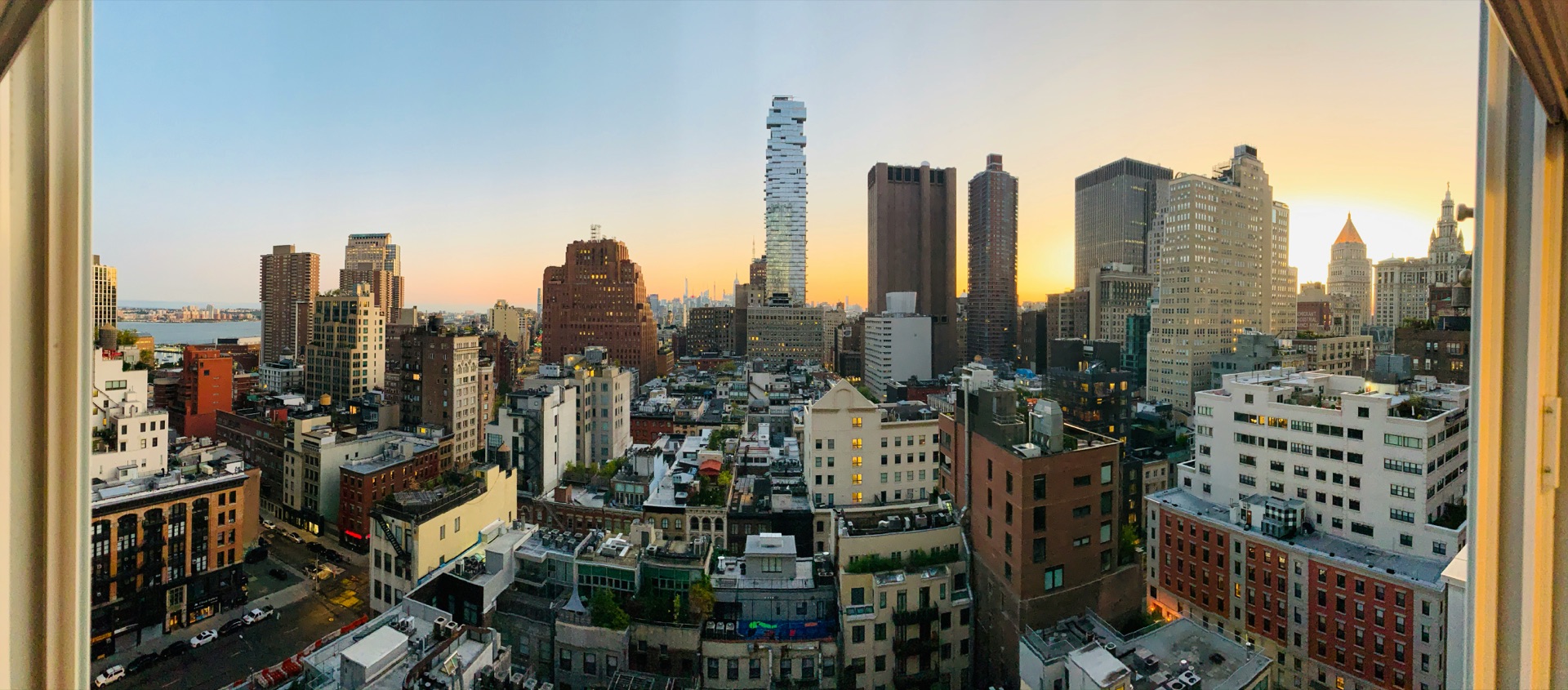
Manhattan Luxury:
The Quarter
Contents
ContentsHow Q3 2026 closed.
| Tier | Contracts | Volume | Median | PPSF | ||||||||
|---|---|---|---|---|---|---|---|---|---|---|---|---|
| Q3 2026 | Q2 2026 | Q3 2025 | Q3 2026 | Q2 2026 | Q3 2025 | Q3 2026 | Q2 2026 | Q3 2025 | Q3 2026 | Q2 2026 | Q3 2025 | |
| Luxury | 183 | 312 −41.3% |
194 −5.7% |
$1.65B | $3.22B −48.6% |
$1.81B −8.9% |
$6.99M | $7.35M −4.9% |
$6.76M +3.3% |
$2,883 | $2,779 +3.7% |
$2,777 +3.8% |
| Prime | 80 | 156 −48.7% |
88 −9.1% |
$1.04B | $2.29B −54.5% |
$1.20B −13.5% |
$9.80M | $11.62M −15.6% |
$10.49M −6.6% |
$3,533 | $3,340 +5.8% |
$3,343 +5.7% |
| Trophy | 15 | 25 −40.0% |
15 +0.0% |
$401.4M | $823.1M −51.2% |
$428.9M −6.4% |
$23.95M | $24.50M −2.2% |
$22.00M +8.9% |
$5,676 | $5,040 +12.6% |
$4,992 +13.7% |
Contracts and Volume match the hero grid above. Source: Data Powered by Marketproof. Quarters recorded since Q2 2021. Foundational Report →
Price per square foot rose across all three Luxury Lines this quarter, while contracts held close to last year's pace. Against Q3 2025, Luxury contracts dipped 5.7%, Prime dipped 9.1%, and Trophy held flat at 15. Luxury PPSF is up 3.8% year over year, Prime is up 5.7%, and Trophy leads at 13.7%. Slightly fewer contracts were signed than a year ago. Those that were carried a higher price tag per square foot.
Prime's median price fell 6.6% year over year. Luxury and Trophy moved the other way. Luxury's median is up 3.3% year over year. Trophy's is up 8.9%. Prime is where the pied-à-terre surcharge bites hardest. Trophy buyers rarely change behavior for a new tax at that price point. Luxury's own entry buyers are mostly full-time residents buying a three- or four-bedroom home for their family, and a primary residence doesn't carry the surcharge at all.
Eleven neighborhoods carried 77.3% of Q3's Luxury dollar volume. Each gets there differently.
Top 11 neighborhoods, trailing twelve months.*
*This report typically features ten neighborhoods. Flatiron's dollar volume this quarter came almost entirely from one building, enough to edge past SoHo's by a slim margin. Rather than drop SoHo, a deep market spread across dozens of buildings, we expanded the list to eleven this quarter.
This section looks at the eleven neighborhoods that produce the large majority of Manhattan's Luxury-tier deal volume over the trailing twelve months, and shows how differently each one gets there. Some, like West Village and Tribeca, are highly concentrated: a large share of everything that sells there clears the Luxury floor, so that these neighborhoods are functionally luxury-first markets. Others, like Upper West Side, are large markets where Luxury contracts are still a minority of all deals. That much non-Luxury inventory pulls down the neighborhood's blended numbers. Think of one dealership selling both a Honda and a Rolls-Royce: blend their prices into a single average, and that average describes neither car. Even where the surrounding market looks different, a Luxury listing there is still a submarket within a submarket.
Ranked by Luxury dollar volume.
All 11 neighborhoods on two axes instead of two table columns. Dot size = each neighborhood's total dollar volume across all price tiers, same trailing-twelve-month window.
Dashed lines mark the median of these Luxury (top 10%) figures across all 11 neighborhoods, shown for reference only.
The scatter chart above shows how these neighborhoods sit relative to each other; it can't show what's inside any one of them. Each bar below covers the entire market (100%), split into exclusive price bands, with Deal-Count Intensity shown as its own bar on the same honest 0–100% scale.
| Rank and Neighborhood | 2025 | 2026 | |||||
|---|---|---|---|---|---|---|---|
| # | Neighborhood | Q4 2025 | Q1 2026 | Q2 2026 | Q3 2026 | QoQ | YoY |
Compared with last quarter to show which buildings drove the swings; see Section 1 for the year-over-year read.
Both of this quarter's biggest movers trace back to new development, though not to the same degree. Central Park Tower alone went from one Luxury contract in Q2 ($8.8 million) to four in Q3 ($100.1 million), a $91.3 million swing against Midtown's entire $17.8 million neighborhood gain. Strip that one building out and the rest of Midtown fell 44.9% quarter over quarter, in line with the usual Q2-to-Q3 seasonal pullback. Lincoln Square's two active sponsor buildings, 50 West 66th Street and 212 West 72nd Street, signed seven Luxury contracts worth $101.2 million in Q2 and none in Q3. That accounts for just under half of the neighborhood's $210.8 million decline; the rest reflects the usual summer slowdown in resale.
Eleven neighborhoods carried $9.10 billion of the $10.98 billion in Luxury contracts signed across Manhattan over the trailing twelve months. That's 82.9% of the dollars and 77.4% of the deals. West Village leads dollar concentration at 72.5%, the highest of the eleven, and even that likely understates it. 80 Clarkson Street alone has signed well beyond what this count reflects, per Section 3's detail, and none of that additional volume is captured here.
Tribeca stands alone at high intensity, leading unit intensity at 33%. One in three deals there crosses the Manhattan Luxury floor, and no other neighborhood on this list comes close. Only 243 total contracts of any price tier closed in Tribeca over the same window, so Tribeca's 79 Luxury deals are a third of all activity there. One unusual sale moves the read more than it would in a larger market like Upper West Side, where 1,137 total contracts dilute any single deal's weight.
Upper West Side has the second-highest Luxury contract count on this list, 115, behind Upper East Side's 137. Its dollar concentration is the lowest here, 35.3%. This is a large market where Luxury is a meaningful but minority layer. A seller here competes against more inventory at more price points than anywhere else on this list.
Entry price to the Luxury tier swings widest at the extremes. Greenwich Village posted this quarter's highest median Luxury contract, $9.95 million, even though it ranks mid-pack on both concentration and intensity. Tribeca posted the lowest median, $6.10 million, despite leading intensity. The gap is 63%. Median and Luxury measure different things, and this quarter they moved apart. Greenwich Village's number is thin, just six contracts, but the expected Q4 launch at 11 West 13th Street by Legion could give it a strong quarter if those contracts get signed and reported in time.
A few of these neighborhoods run almost entirely on one or two buildings. This section names them.
The new development that defined the quarter.
No neighborhood framing here, just the dollar. Every sponsor-building Luxury-tier ($4.98M+) signed contract, July 1–September 30, 2026, Manhattan-wide, ranked by building. Five buildings carried 68% of it.
Verified against each building’s own year-built and building-status record.
This $422.3M is what shows up in standard contract-activity data. A handful of buildings are selling quietly, outside the public listing feeds that number depends on, and each one understates the real total:
- 44 West 8th Street has a third signed contract, an $18.5M penthouse, that doesn’t show up in the quarterly data above, which only captures two of the building’s three contracts.
- 14 White Street shows zero contracts and 100% unsold in Marketproof’s own building-level tracker. Units there are understood to have sold; the listing agents simply haven’t reported those contracts yet.
- 80 Clarkson Street has 23 units in contract. None of those 23 contracts appear in the quarterly contract data this report relies on, so the building’s full activity isn’t reflected in the totals above.
The real Q3 number is higher than $422.3M. How much higher, no one can say. Those contracts aren’t disclosed anywhere.
Five buildings carried 68% of every Luxury new-development dollar signed in Manhattan this quarter, and they’re not at the same point in their sale. Central Park Tower closed five years ago and still produced the single largest contract in the city this quarter, $54.9M. The Flatiron Building has been selling for less than a year and already matched that volume. One High Line, three years past its first closing, didn’t need a headline sale: three separate contracts added up instead. One $26.9M sale was enough for The Henry.
Those building premiums don't stay contained to one address. This section shows what they do to the neighborhood around them.
Where the Luxury premium concentrates.
This table covers Luxury-tier contracts, $4.98M and up. Neighborhood PPSF (price per square foot) ranges from roughly 1.4× the borough average in Midtown down to about 0.7× in Upper West Side.
This table's PPSF window is trailing 13 weeks (one quarter), matching Section 1.
Disc. from Ask = average discount-to-list %, Luxury closed sales only ($4.98M+, ACRIS-recorded closings, Q3 2026). This is a different population and timing than the rest of this report, which is signed-contract based. Closed sales lag contract signing by months, so this isn't the same deals as Sections 1/2/5's current quarter.
5-year PPSF trend by neighborhood, 5 TTM-ending-June years, toggle to the PPSF metric. Foundational Report, Part 4 →
Flatiron's PPSF jumped 76.9% year over year, the sharpest move in either direction this quarter. That traces straight back to Section 3: the Flatiron Building alone is 72.3% of the neighborhood's entire Luxury volume, and its $4,730/sqft asking far outpaces what resale there commands. The discount-from-ask figure for Flatiron is too thin to trust on its own, just 3 closed sales, one of them a stale listing sold 64% off a since-reduced ask.
West Village fell 22.8% year over year, the steepest decline of any neighborhood, despite carrying two of this report's highest-premium new buildings. 80 Clarkson Street and 140 Jane Street, the neighborhood's own two entries in Section 3's table, both command well over 140% above the neighborhood's resale baseline, yet the blended PPSF here still dropped more than anywhere else. The new-development premium and the broader resale market are moving in opposite directions in the same neighborhood. 80 Clarkson Street alone has 23 units in contract, and none of them appear in this quarter’s data. If those contracts were counted, this number would look very different.
Discount-from-ask is moving in opposite directions across neighborhoods. Upper East Side and Midtown both firmed, with buyers conceding less than a year ago (Upper East Side 7.5% to 1.1%, Midtown 11.5% to 6.2%). Lincoln Square moved the other way, its discount widening from 3.7% to 13.4%, even as its PPSF barely moved (+2.8%). In Lincoln Square, focus on the submarket you're actually transacting in, not the neighborhood headline.
Price is only half of what a listing competes on. The other half is speed. This section covers how fast Luxury is moving, and how much of it is still unsold.
How fast is Luxury moving?
Luxury contracts only · Borough avg: 165 days · % = speed vs borough avg (positive = faster, negative = slower)
| Quarter | Luxury | Prime | Trophy | ||||||
|---|---|---|---|---|---|---|---|---|---|
| Inventory | QoQ | YoY | Inventory | QoQ | YoY | Inventory | QoQ | YoY | |
| Q4 2025 | 965 | −1.0% | −17.0% | 600 | −1.8% | −14.8% | 157 | −3.7% | −4.3% |
| Q1 2026 | 776 | −19.6% | −29.8% | 485 | −19.2% | −26.4% | 124 | −21.0% | −21.0% |
| Q2 2026 | 853 | +9.9% | −9.1% | 523 | +7.8% | −9.0% | 141 | +13.7% | −7.2% |
| Q3 2026 | 1,030 | +20.8% | +5.6% | 649 | +24.1% | +6.2% | 168 | +19.1% | +3.1% |
Same underlying series as this report's quarterly table above. Foundational Report, Part 5 →
Both borough averages on this page, 165 days (DOM) and 11.6 months (supply), are computed across the full Manhattan Luxury dataset, rather than as an average of the 11 neighborhoods charted above. The 11 rows shown average to roughly 155 days and 11.2 months on their own; that gap is expected, since the borough figure includes activity outside the top 11 too.
Luxury supply edged up a month from last year, still well inside its four-year range. Supply rose to 11.6 months from 10.6 a year ago, a one-month expansion. 1,030 active Luxury listings now sit against 88.5 monthly contracts, up from 975 listings and down from 92.1 contracts a year ago. That's still well inside this market's four-year range: the tightest reading on record is 3.7 months (Q2 2022), the loosest is 19.5 months (Q3 2023).
New-listing activity briefly spiked the week of September 7, when Compass International Holdings relisted a wave of existing inventory citywide. That week's count hit 598, against a typical 200–400, before fading back to baseline within three weeks. A relist withdraws a unit and reissues it as new, which resets that listing's own clock but adds no net inventory to the market, so it didn't move this quarter's months-of-supply figure in a meaningful way.
Days on market is less reliable this quarter. A reset clock reads as a fresh listing, so this quarter's day-on-market figures, borough-wide and by neighborhood, understate how long that relisted inventory has actually been sitting on the market.
Speed varies far more by neighborhood than the borough average suggests. West Village sells in 96 days, 1.7 times faster than the 165-day borough average. Flatiron takes 303 days, 1.8 times longer. Seven of the eleven neighborhoods in this report move faster than the borough average. Flatiron's long read is a timing artifact. Its only building driving volume launched sales in January 2026, and this quarter's contracts were signed within that building's first eight months on the market, covered in Section 3.
Days on market is proving to be an unreliable metric. A wave of Compass International Holdings relistings the week of September 7 reset the clock on part of the inventory, so supply and absorption, at 11.6 months on 1,030 active Luxury listings against 975 a year ago, is the number worth watching instead. That raises a bigger question. Should days on market even be a metric we track, let alone one that moves how a property gets valued?
No data source is complete. So long as inventory stays obscured, we're always missing a slice of the market. Manhattan shows 7,167 publicly active listings today. Add 526 Participant-only listings, visible to agents but never published publicly, and the real total climbs to roughly 7,700, before counting the new development that sells without ever appearing in a listing at all. Closed sales lag the contract date by 60 to 120 days, which makes them the slowest read of all.
Domi Data tracks signed contracts instead: by the week, by the month, by neighborhood, by quarter, with a close watch on new-development activity. That's the closest read on this market available.
Methodology & Sourcing
- Luxury (Top 10%) = $4.98M, Prime (Top 5%) = $7.38M, Trophy (Top 1%) = $18.07M: Domi Data™ Luxury Lines calculations, all Manhattan signed contracts, trailing twelve-month window (October 2025–September 2026). Floors update weekly on heatherdomi.com.
- Unit intensity = Luxury contract count ÷ total neighborhood contract count.
- Dollar concentration = Luxury volume ÷ each neighborhood’s own total volume (all price tiers). Prime and Trophy use the same denominator and feed only the Section 2 detail cards’ stacked bars. The overview scatter plots Luxury concentration and unit intensity only. Both metrics are shown on true 0–100% scales. Neither is normalized to the sample’s own maximum.
- Prime and Trophy dollar-volume shares use that same source and formula: volume at or above each tier’s borough-wide floor ($7.38M for Prime, $18.07M for Trophy), divided by each neighborhood’s own total volume.
- Neighborhoods with fewer total contracts and a handful of very large sales will show more movement in Prime/Trophy share between pulls than higher-volume, more diversified neighborhoods. West Village is the clearest example this cycle: 4 signed contracts above $27M make up roughly a fifth of its entire trailing-window volume. A single large deal entering or aging out of the trailing twelve-month window can shift the ratio by several points on a small base. That's the expected volatility of a concentrated market.
- Signed contracts only, sourced via Data Powered by Marketproof, starting Q2 2021.
- Neighborhood totals: October 2025–September 2026 trailing twelve months. Quarterly panels: Q4 2025 (Oct–Dec), Q1 2026 (Jan–Mar), Q2 2026 (Apr–Jun), Q3 2026 (Jul–Sep).
- Section 4's PPSF window is trailing 13 weeks, one quarter. Section 3 uses a full trailing twelve months instead, since it ranks buildings by TTM dollar volume. The borough average in Section 4's “vs Boro Avg” column ($2,883/sf) is sourced the same way as its neighborhood rows. Section 1's $2,883 headline PPSF covers that same Q3 2026 quarter. The two figures are calculated independently and land a few percent apart because of that. Neither one measures a full year.
- Construction cost trend (‡): Turner Construction Cost Index, 2016–2025, directional context only.
- Section 3's 14-building table: building-level detail confirmed via completion year, first-closing date, sponsor/resale sale composition, and per-unit sale history, which corroborates and extends the dataset’s own sponsor/resale tag. Nbhd PPSF (excl.) computes its resale baseline after removing every new-development building in that neighborhood. Sales Start dates marked † (Central Park Tower, 35 Hudson Yards, Towers of the Waldorf Astoria) are sourced from public record.
- Neighborhood ranking/order throughout this report (Section 2's composition cards and the quarterly trend table) is based on trailing-twelve-month (TTM) Luxury dollar volume, consistent with the ranking basis used on The Week and the Foundational Report.
- Full 21-quarter cycle history: Luxury/Prime/Trophy contracts, volume, and median price back to Q2 2021, including the Q3 2022 Trophy freeze. Foundational Report, Part 3 →
Abbreviations
- TTM · Trailing Twelve Months
- YoY · Year over Year
- QoQ · Quarter over Quarter
- MoS · Months of Supply
- DOF · Department of Finance